
KTBSOnline: Benefits Enrollment Redesign
Client: Kelly Benefits
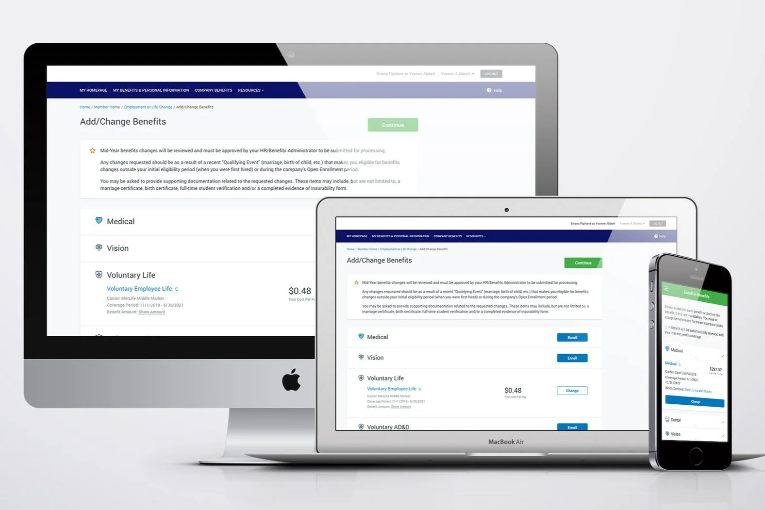

KTBSOnline is a fully customized benefits management platform used by HR professionals and employees. The benefits enrollment path, its most frequently used and visible feature, was confusing, visually outdated, and not mobile-friendly. Many users abandoned the process and resorted to calling support, which created inefficiencies and hurt user confidence.
The Opportunity
Our redesign needed to:
Improve clarity and ease of use
Modernize the UI to better compete with contemporary platforms
Introduce a responsive design that enabled mobile enrollment for the first time
Set the visual and UX foundation for a larger platform-wide overhaul
My Role & Responsibilities
Conducted design research and gathered user pain points
Co-led ideation and design workshops
Created and tested interactive prototypes using UXPin
Developed a scalable visual system, including typography, color palette, and iconography
Delivered developer-ready UI designs for both desktop and mobile
Design System Highlights:

Custom-designed icons were created to represent benefit types and services across the platform. Consistent styling helped guide users through complex options with clarity and ease.

Established a clean, modern interface using the Roboto typeface for its clarity, accessibility, and strong readability across devices.

Standardized button behavior and navigation to create a consistent, predictable experience. The layout was simplified to guide users step-by-step through enrollment. A green primary CTA reinforced action and approval, while blue and white served as secondary options. Color-coded states and alert patterns improved at-a-glance comprehension for errors, confirmations, and warnings.
Usability Testing
-
Plan Selection Flow: Users found plan cards consistent, easy to compare, and visually scannable.
Cost Transparency: Real time calculations helped users feel confident in their selections.
Confirmation Page: The summary and download link were universally used to verify final choices.
-
Declining Coverage: Clicking into every benefit to decline felt tedious and confusing.
Terminology & Instructions: Unfamiliar acronyms and error-prone fields lacked inline help.
Child/Spouse Life Insurance: Users were confused by the separation from the main Life section.
Assumed Behavior: Button labels and page logic didn't always match user expectations.ion text goes here
-
Declining benefits was harder on mobile due to extra steps and unclear interactions.
Benefits summary wasn’t optimized for small screens and required too much scrolling or zooming.
One user created a fake spouse just to trigger the decline option, highlighting a flaw in logic.
-
Testing revealed gaps in user expectations, especially around enrollment logic.
Insights led to specific design fixes: clearer labeling, fewer steps to decline, and better grouping of benefits.
The final design was faster, less error-prone, and more respectful of user context.
To ensure the redesigned KTBSOnline enrollment experience was not only visually clean but truly user-friendly, I conducted multiple rounds of usability testing with real users on both desktop and mobile. These sessions uncovered hidden friction points, invalidated a few assumptions, and helped shape a smoother, more intuitive final product. Below is a breakdown of those insights and how they directly informed design changes.

Results & Impact
The final KTBSOnline redesign was directly shaped by usability insights, and it made a measurable difference. Here’s what changed, and why it mattered.

Measurable Improvements
Faster Enrollment
Streamlining the decline process and improving layout clarity reduced the average time it took users to complete enrollment.Fewer Help Desk Calls
Grouping related benefits and clarifying instructions (especially for Child and Spouse Life) led to a noticeable drop in questions to HR during open enrollment.Increased Completion Confidence
All users relied on the updated summary screen to verify their elections. Clear visual cues and cost breakdowns helped reduce confusion and second-guessing.Improved Mobile Experience
By optimizing touch targets, simplifying interactions, and improving responsive layouts, mobile enrollment became much more accessible and less frustrating.

Real-World Feedback
After launch, a new client, Cardone Industries, shared unsolicited feedback with the internal team. Their HR VP described KTBSOnline as “so much easier to use than BenefitFocus.” The client also reported significantly fewer support calls than expected, even though many employees were using an online enrollment platform for the first time and spoke English as a second language.
“She was surprised she hadn’t received a call from the CEO asking how to use our site. That’s usually a given.”
- Feedback shared by a Director at Kelly Benefits
This feedback echoed what we observed in usability testing: the experience was easier to navigate, more accessible across devices, and less dependent on hand-holding or external support.

What This Demonstrates
Real users often take paths designers don’t expect, but testing reveals where the process breaks down.
Small decisions like input hints, button placement, and wording can have a big impact on user trust and flow.
Effective UX design isn't just about adding polish. It’s about removing friction so people can complete important tasks with ease.

Mobile Enrollment Experience: Designed and launched the first mobile-responsive version of KTBSOnline’s benefits enrollment flow. The new mobile experience gives users full access to dependent management, plan selection, cost visibility, and digital ID cards, all optimized for small screens. Clear navigation, smart defaults, and progress-driven interactions help users complete enrollment confidently from any device.

Member Home Page Redesign: Streamlined the dashboard experience for KTBSOnline users by introducing clearer navigation, improved task visibility, and a modern, accessible UI.

Dependents Page Redesign: Redesigned the KTBSOnline dependents page to improve clarity, usability, and accessibility. The updated layout features card-style formatting, clearer action buttons, and modern visual design to make it easier for users to review, edit, and manage dependent information with confidence.

Enrollment Page Redesign: Simplified and modernized the KTBSOnline benefits enrollment experience. The updated design replaces a dense, table-based layout with a clear, mobile-friendly interface featuring collapsible sections, consistent CTAs, and real-time cost visibility. This helped users navigate their choices with ease and confidence.